edX
A complete redesign of the edX enterprise website, with a focus on increasing lead capture conversion rates.
Background

edX is an online education platform owned by 2U, similar to Coursera and Udemy. They manage a variety of offerings-including enterprise level courses. Deloitte Digital partnered with them in an 8-week initiative to re-design their entire enterprise website and site navigation.
My Role
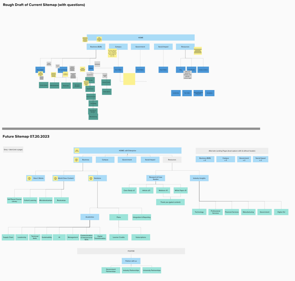
I conducted heuristic and competitive analyses to inform our design strategy. Additionally, I took charge of creating wireframes for various pages, including industry, blog, landing, homepage, academy, and academy landing page, ensuring a comprehensive and user-friendly layout. Developing a sitemap, I organized the information architecture to enhance overall navigation. Moreover, I played a pivotal role in crafting and facilitating design workshops and interviews with clients, fostering collaboration and gathering valuable insights. Taking the lead in client design review sessions, I ensured alignment with project goals and client expectations
TIMELINE
June 2023 - August 2023
TEAMMATES
Nick Fries - PM
Andrea Cassar - UX Lead
Zahra Lu - UX Designer
Roy Purbayan - UI Designer
TOOLS
Figma/FigJam, Miro
The Challenge
Website does not reflect updated sales infrastructure
edX recently transformed their sales infrastructure, where they are selling courses in packages called academies. They are also broadening their offerings to the government, university, campus, and social impact sectors.
Low user engagement
edX lead capture conversion rate was around 1%, which is below average for a typical enterprise website in their market. Low user engagement could be due the inability to effectively convey value proposition, lack of trust signals, and poor site navigation.
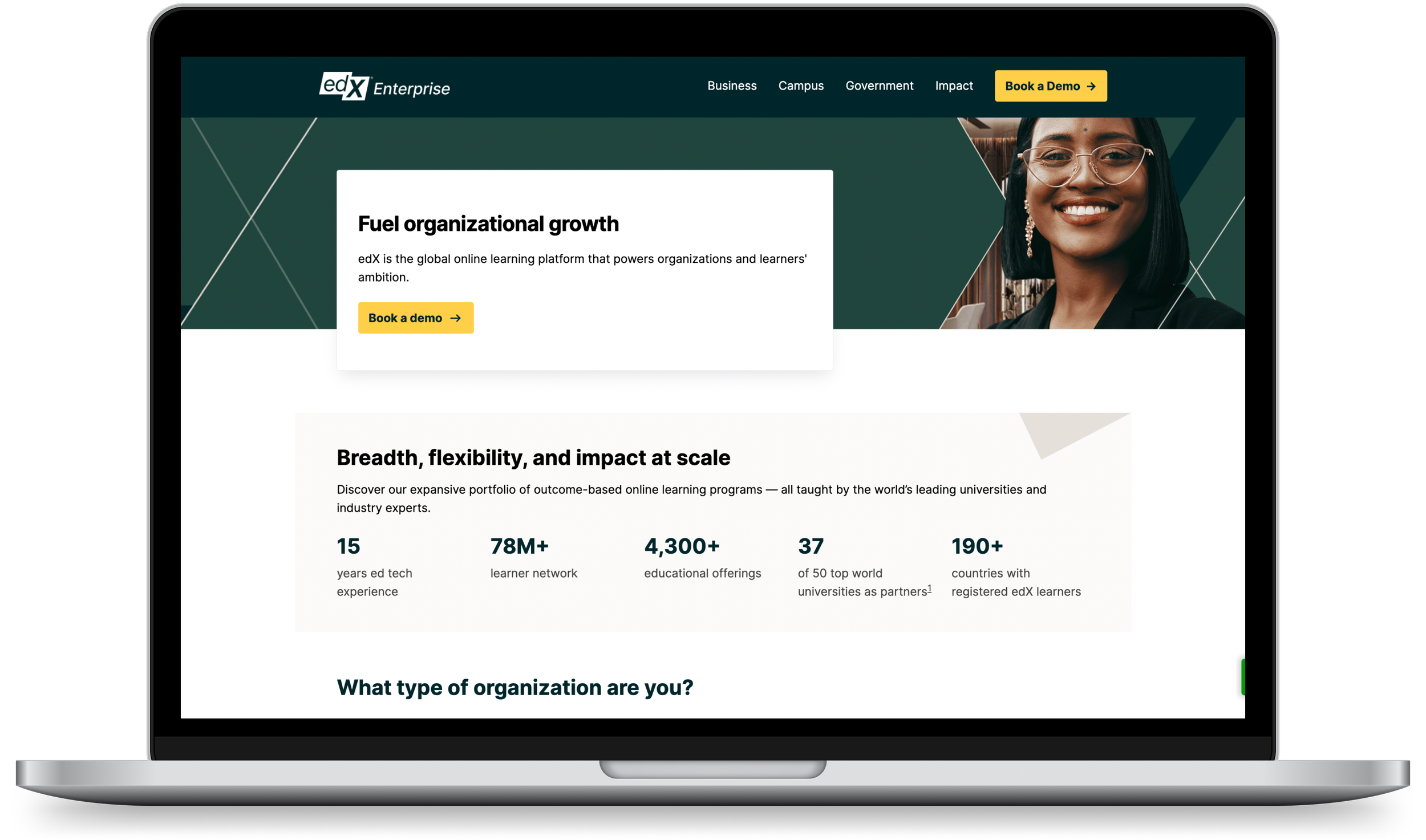
The Home Page
Users take 5 seconds to determine whether they want to stay on your site. We had to make a lasting first impression.

Tangible, impactful data showing edX’s unique value.
We presented measurable metrics showcasing the impact of edX on organizations, providing a swift and clear means to highlight how edX sets itself apart from competitors

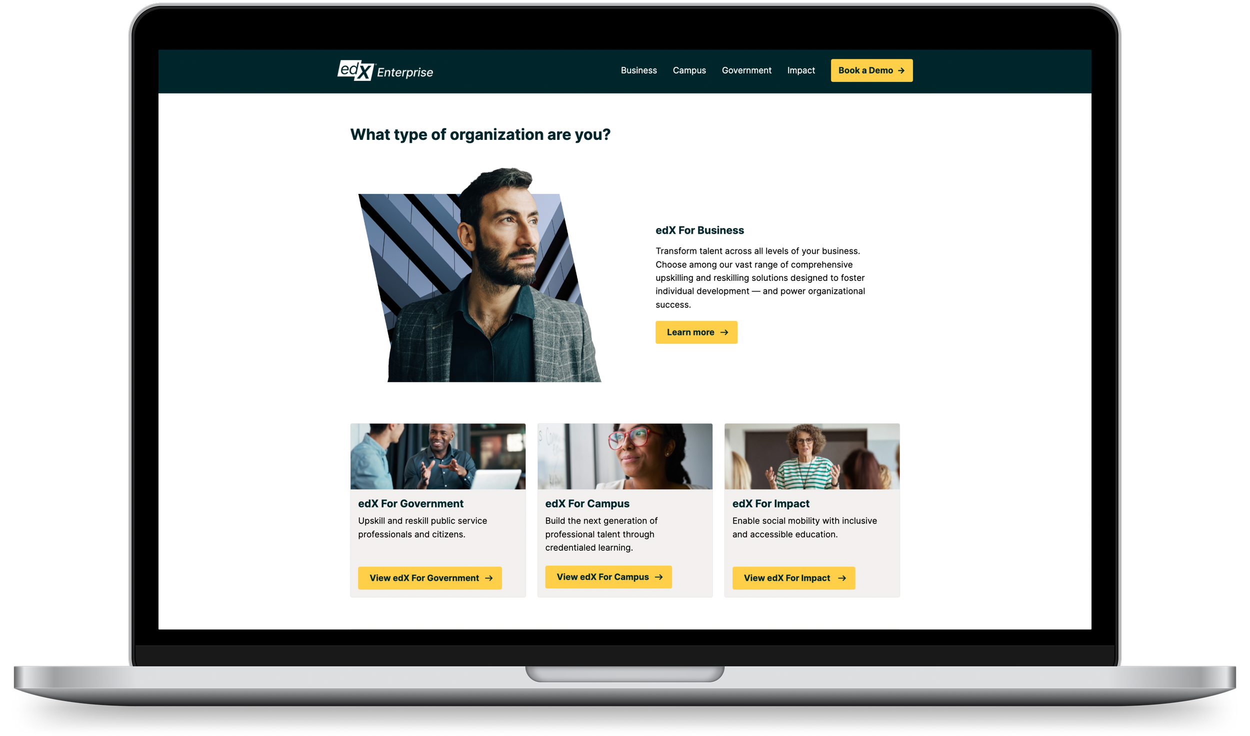
Visibility on all of edX offerings.
We highlighted edX offerings and incorporated a call-to-action guiding users to the relevant landing page, enhancing visibility across the entire range of offerings, and ensuring a more intuitive navigation experience throughout the site.
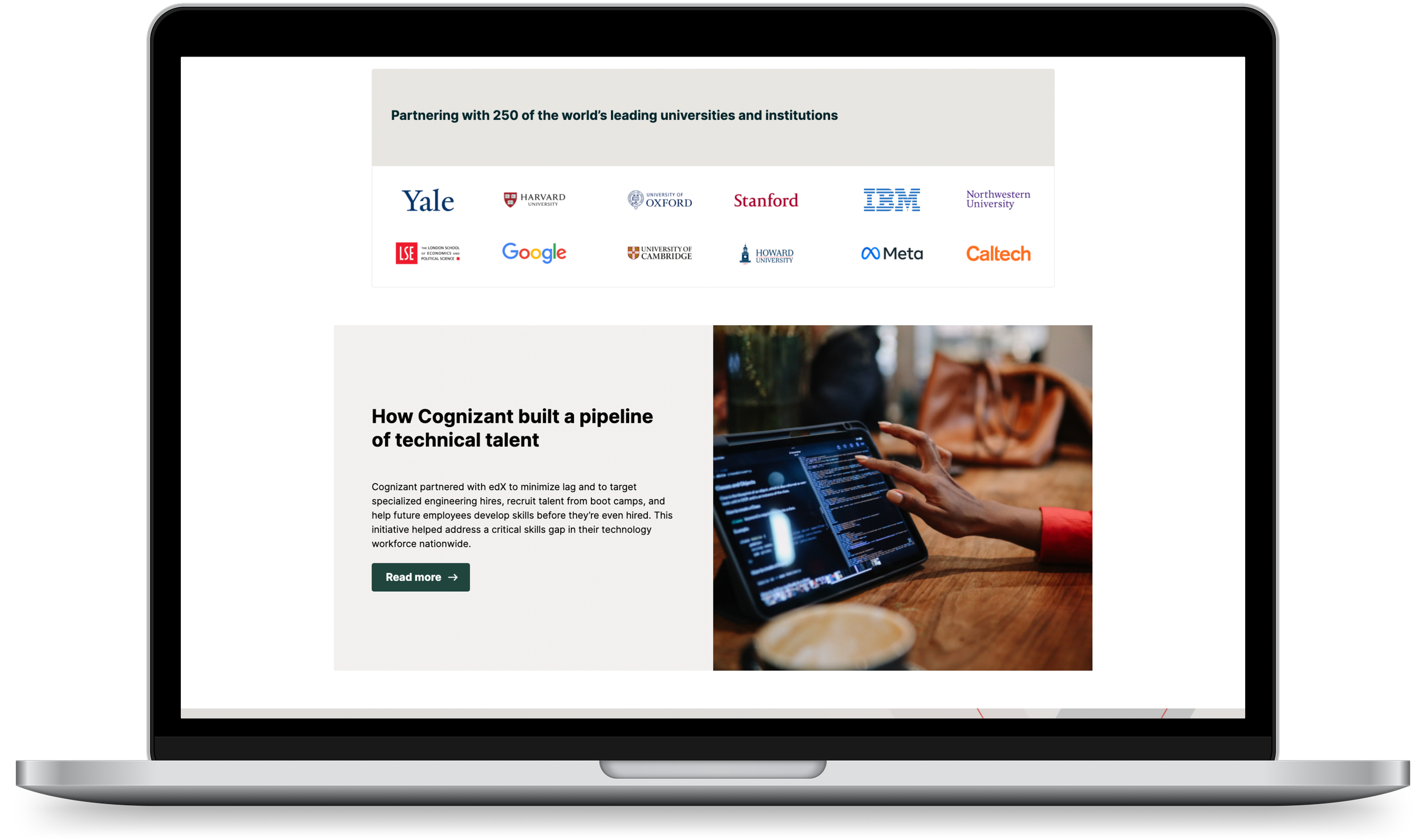
Improving credibility through trust signals.
Establishing credibility is crucial for any B2B site. We bolstered edX's credibility by showcasing the prestigious academic institutions they collaborate with, and leveraging case studies as social proof to validate the effectiveness of their product.
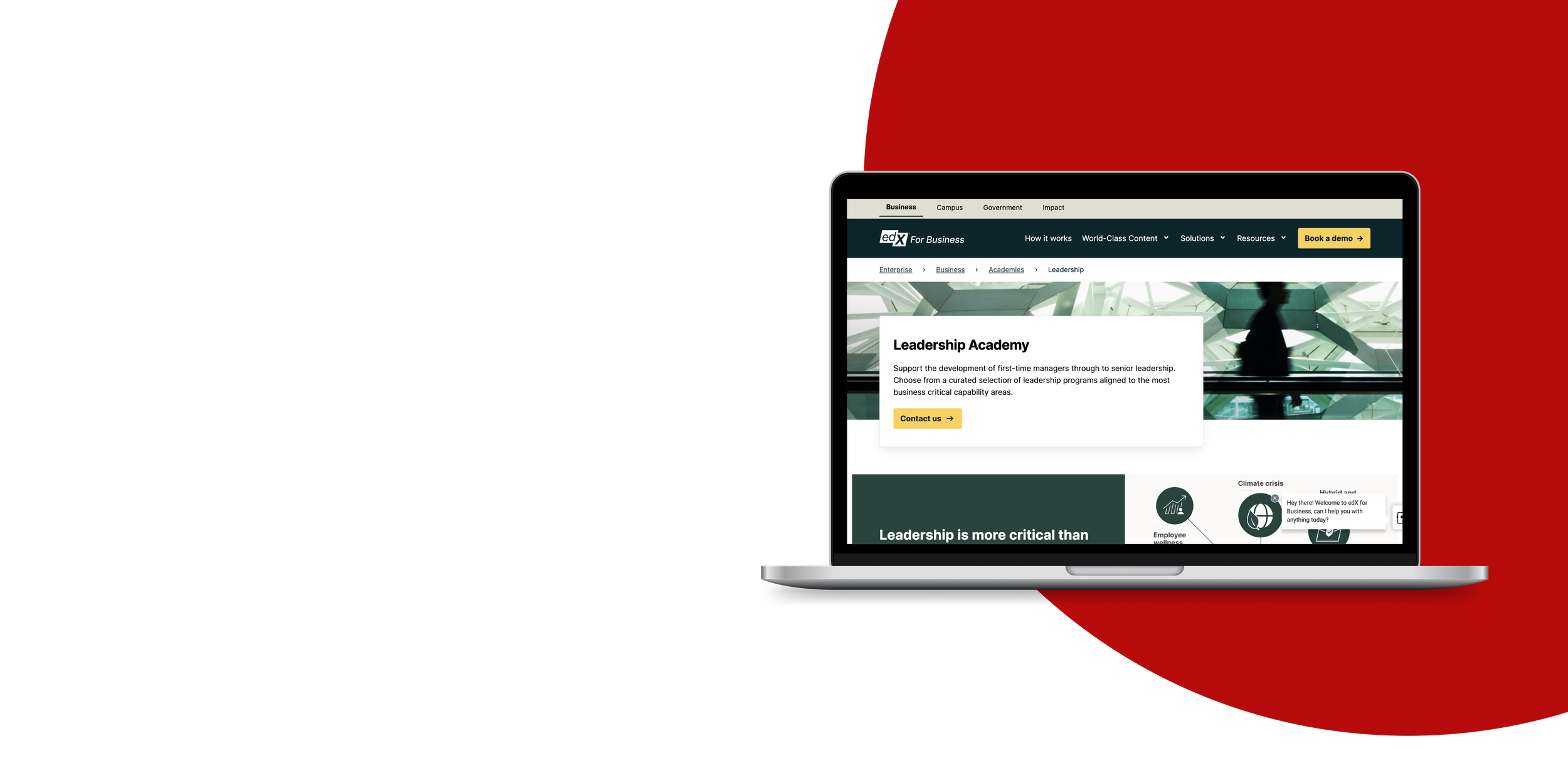
The Academy Page
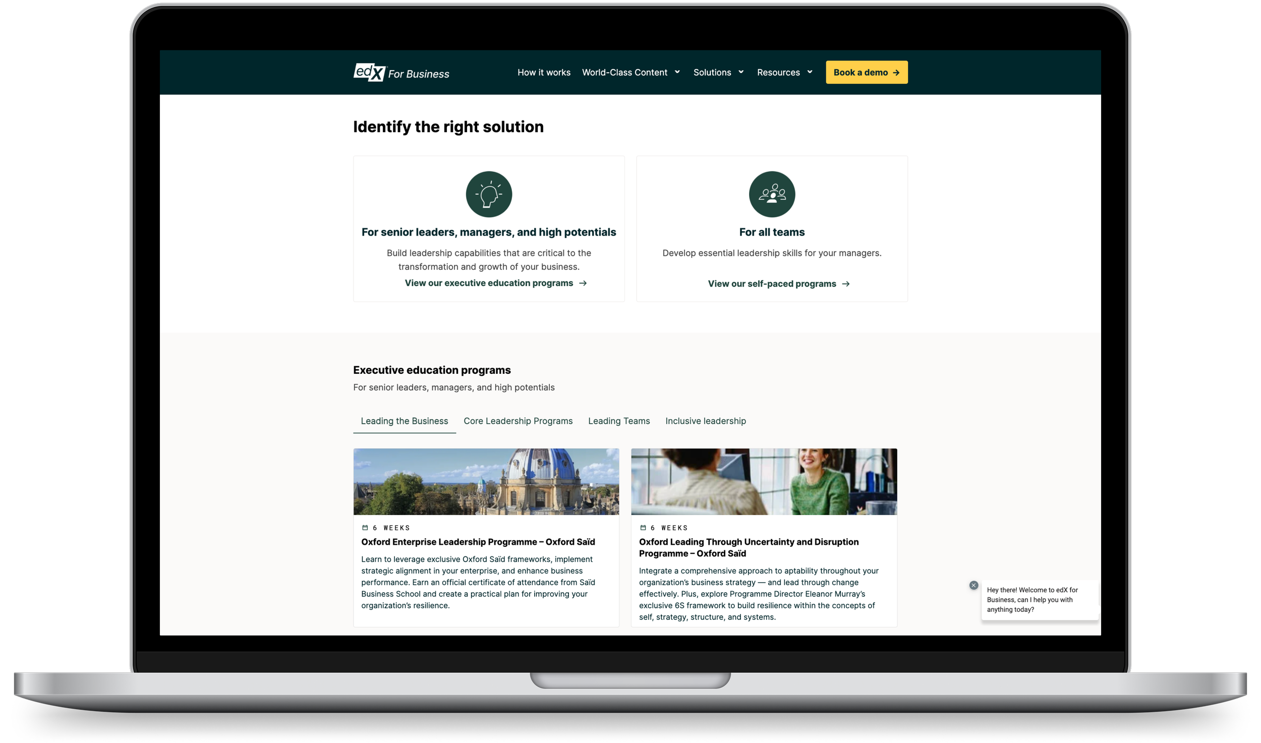
A place for user’s to get comprehensive information on how edx can solve their organization’s challenges.
Optimized browsing experience for course content.
The course content is categorized according to organization size and anchor links guide users to relevant information. An interactive table enhances the browsing experience, allowing users to effortlessly explore content. To further streamline the journey, a compelling Call to Action (CTA) encourages users to visit the demo page, strategically optimizing the conversion process for lead capture.
The Resources Page
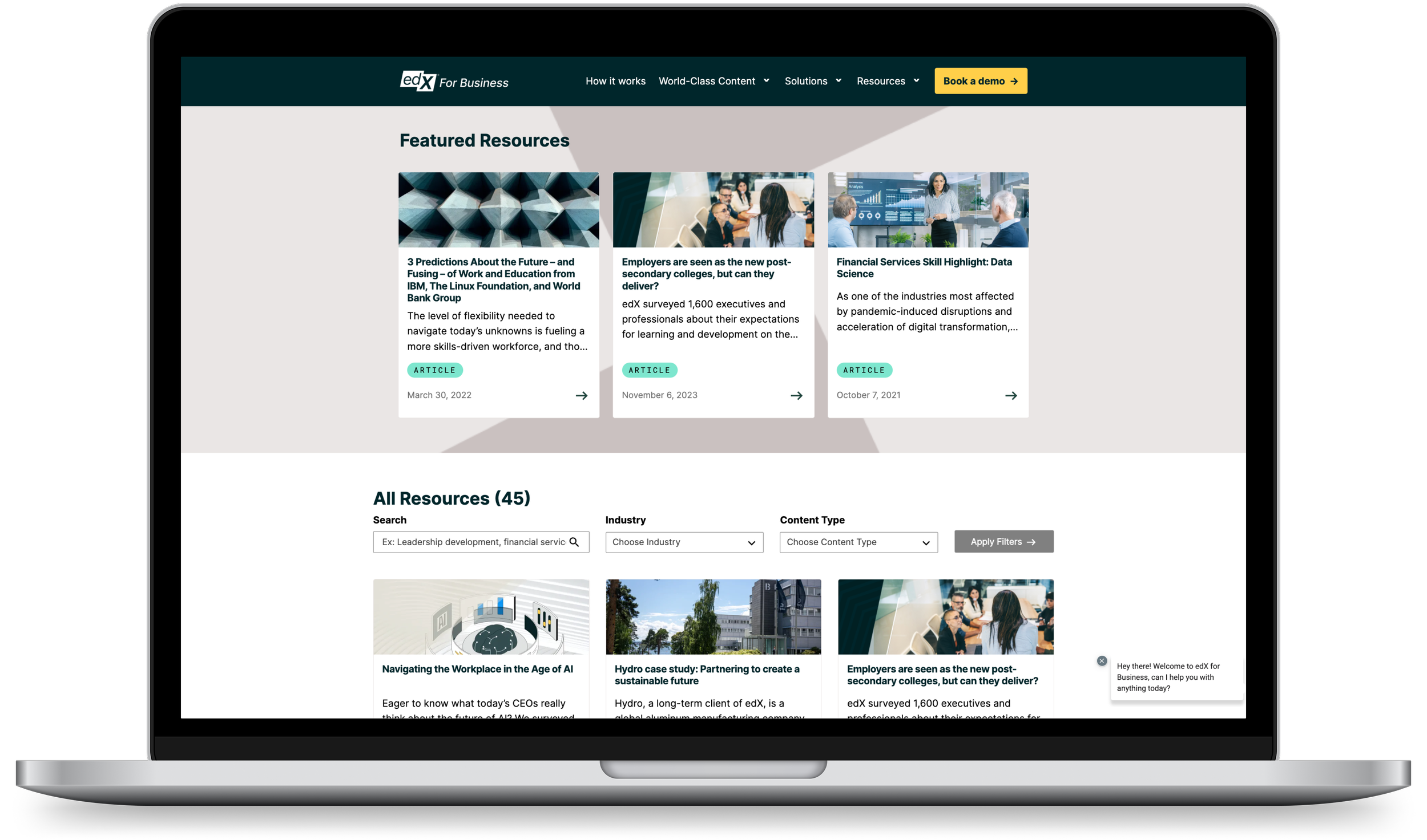
An effortless browsing experience is important for any resources page.
Enhanced content discovery.
We highlighted featured articles to enhance engagement by capturing attention, signaling importance, and providing a structured entry point to relevant, visually compelling content. We implemented filtering with a search bar for a user-friendly browsing experience, ensuring quick access to targeted content.

Discovery
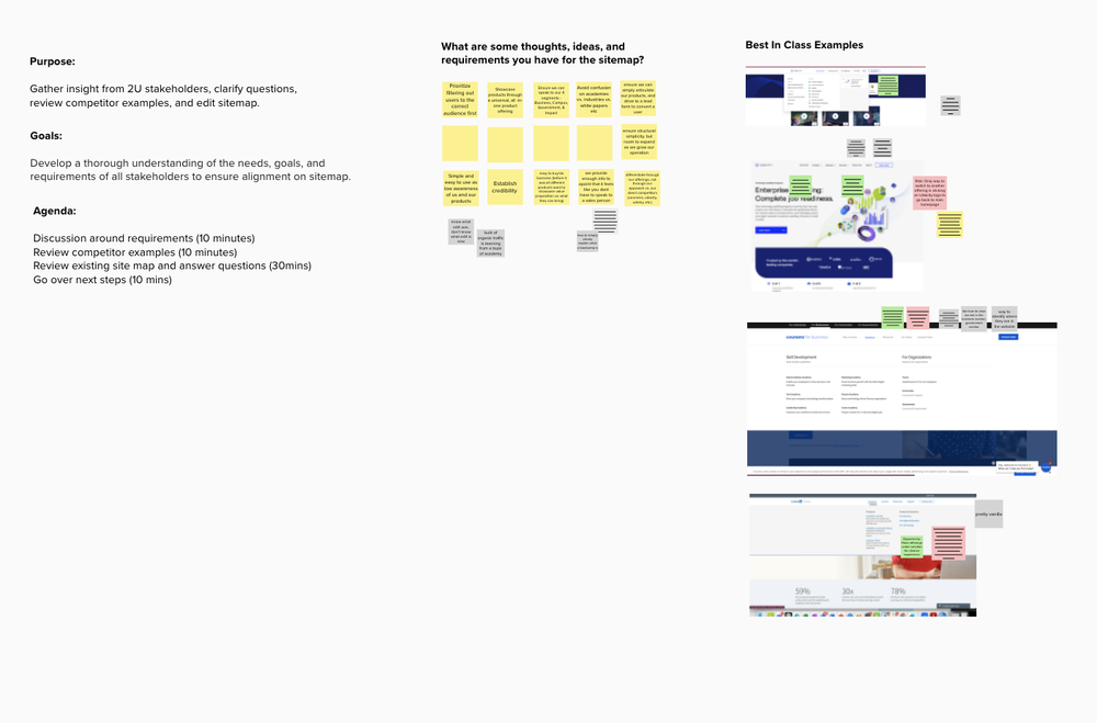
Design workshops and stakeholder interviews to understand our client’s business goals, set up success metrics, and gather information on their users.
UX audits to identify usability issues and competitive analyses to understand industry standards and identify opportunities for improvement.
My Process

Ideate
Multiple rounds of wireframes for each page, going over different interaction patterns, page layouts, and UX copy with stakeholders.

Design
Documentation of wireframes to ensure smooth hand-off to UI
Multiple meetings around UI design.
STAKEHOLDER WORKSHOPPING
Alignment on Product Direction
Before beginning to design, our team wanted to understand the business needs, experience needs, and existing pain points. We organized several workshops and informal interviews with the client to really understand who their users were. Some questions we asked were:
What are your success metrics?
What’s the goal for the information hierarchy?
What are some of the challenges your user’s face when using the website?
Do you have any insight on how people search for products? Do they typically start out with specific skills in mind or search by the industry their company is in? Both?
Do you know what the most important information users take into consideration when it comes to purchasing a product?
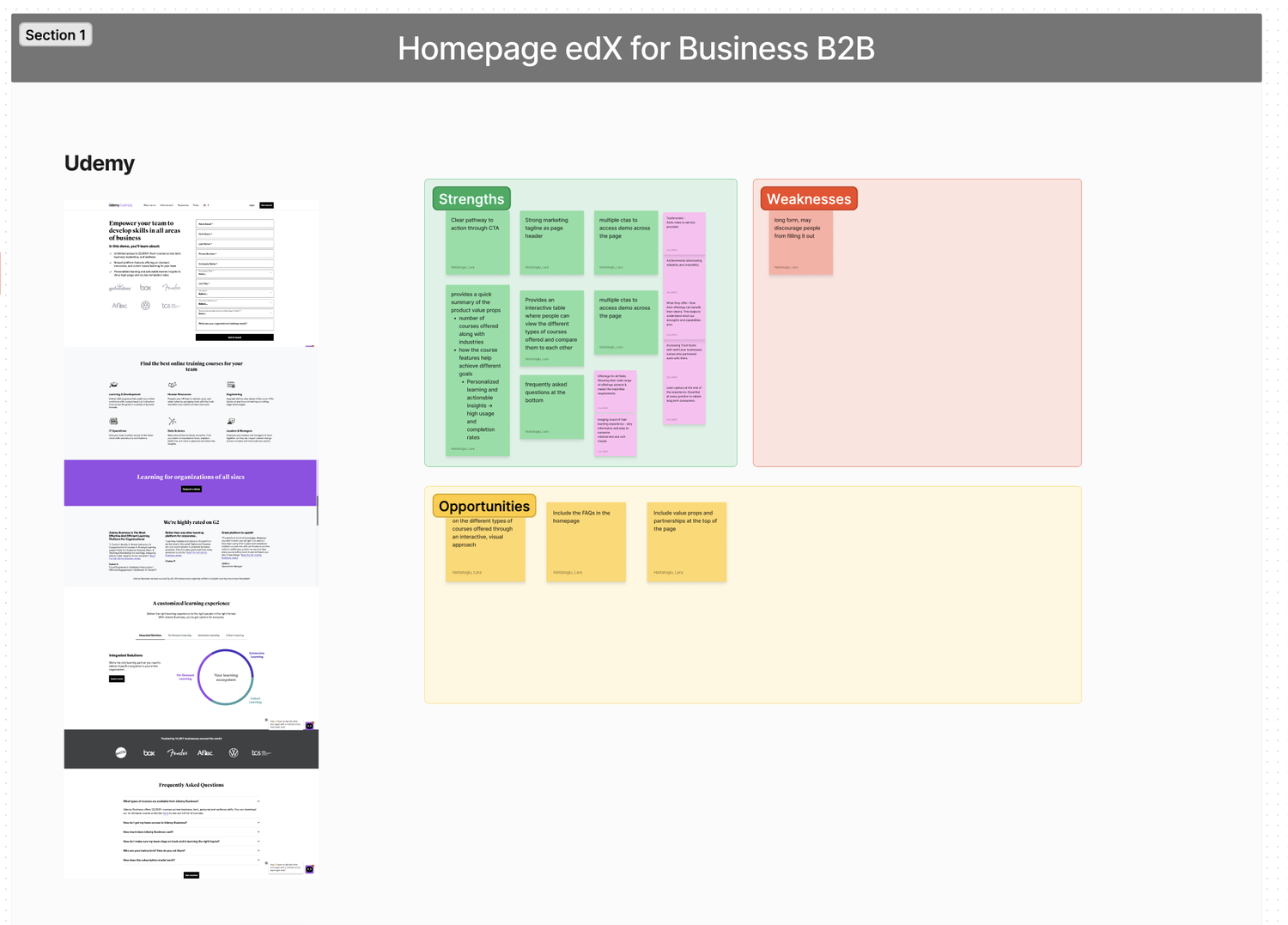
COMPETITIVE ANALYSIS & UX AUDIT
Bringing edX Up To Industry Standards
For each page, I performed a UX audit to identify usability issues, ensure consistency within the design, and pin point different areas to optimize for conversion rates.
I compared the product's user experience against competitors to identify opportunities for differentiation and improvement. Our analysis encompassed their strategies for website navigation, user funneling, and page nomenclature. Additionally, we scrutinized their diverse approaches to content marketing and user engagement on their respective websites.