Get Green
Background
Get Green is a mobile app that offers actionable sustainability tasks that people can easily integrate into their daily routines.
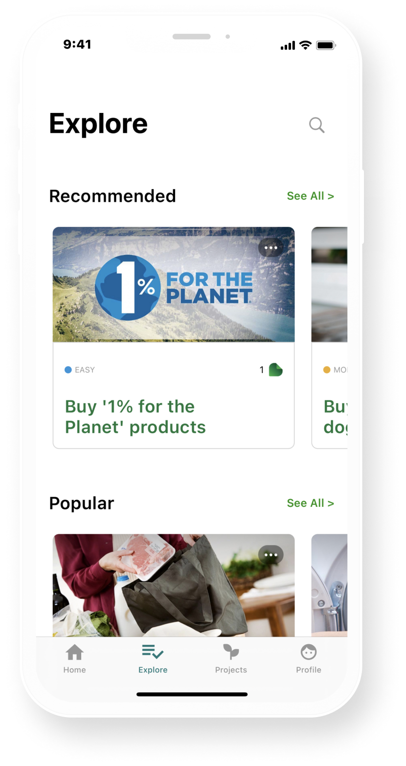
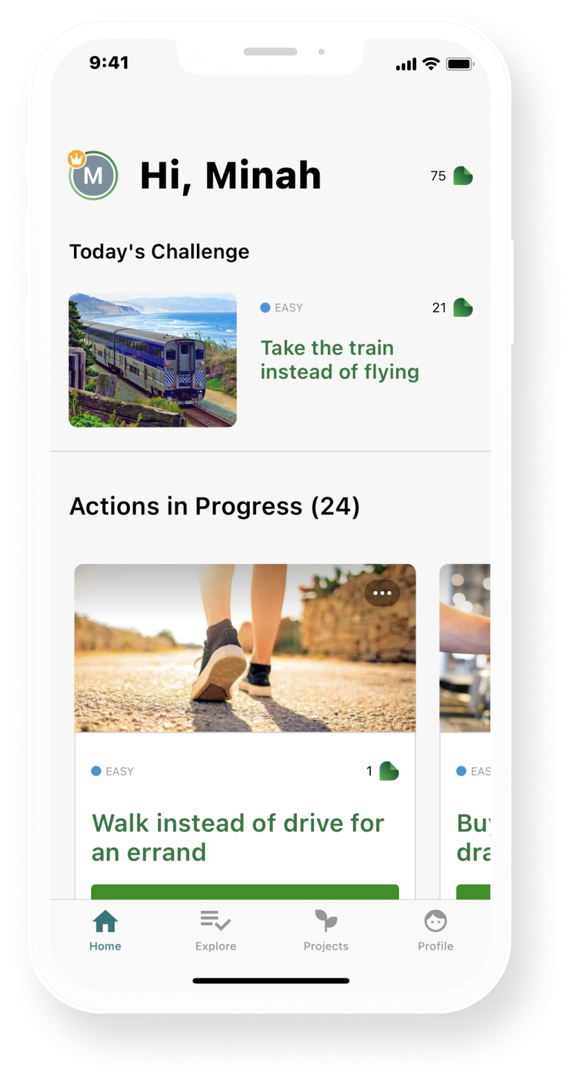
These tasks are as simple as choosing to eat a plant-based meal one day a week or replacing your gym workout with an outdoor workout. As you complete these tasks, you are rewarded leaves that can then be donated to various carbon removal projects. Our team partnered with Get Green to re-design their mobile app experience with a focus on improving the beta version of their geo-location features.
My Role
I assisted with all design deliverables but took ownership over the survey, wireflows and designed the homepage medium-fidelity screen.
TIMELINE
Jan 2022 - June 2022
TEAMMATES
Roz Gillie, Cato Cannizzo, Sebastian Priss
TOOLS
Figma/FigJam, Google Surveys, Usertest.com
The Challenge
The GetGreen app faced issues retaining users long-term. This was because it lacked a clear task structure, in-app guidance, personalization, and features that encourage habit formation.
THE SOLUTION
Experience tailored to your sustainable goals.
We wanted to make things more intentional—allowing people to focus on actions that truly matter to them and have them feel like their actions lead to an end goal. Therefore, we centered the entire experience around completing goals rather than individual actions. In the onboarding process, users can select sustainability goals that interest them and choose corresponding actions to that goal.
THE SOLUTION
A personalized, action plan for effortless action discovery.
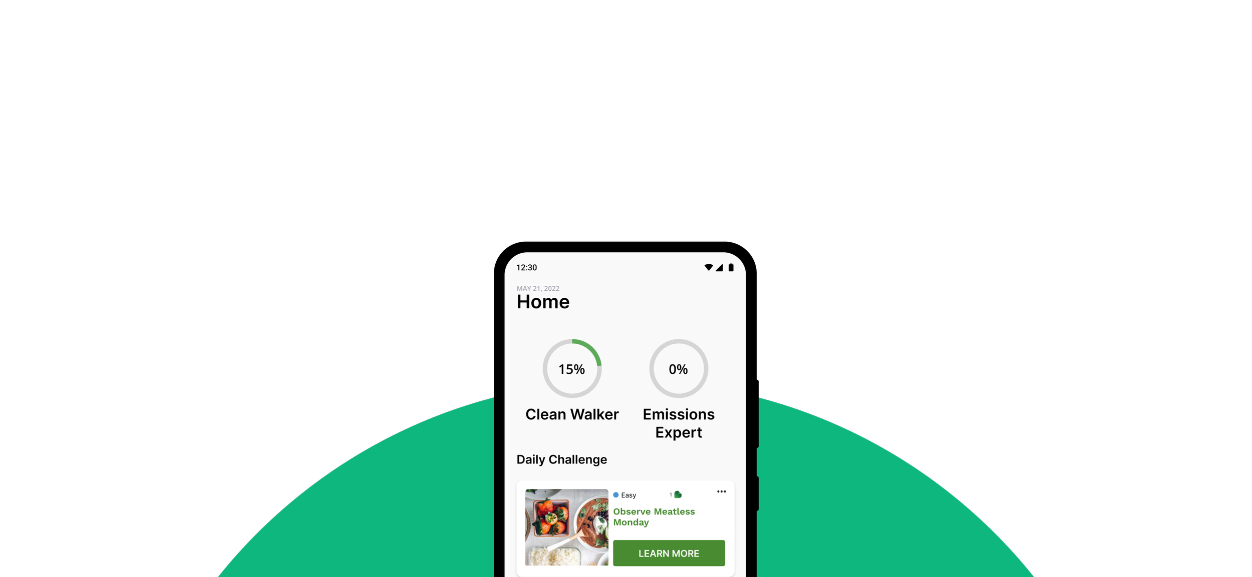
An individualized action plan is generated for users after their onboarding process. They receive 1-3 personalized daily action suggestions and can re-arrange them based on preference. Furthermore, users have the option to transform specific actions into habits by specifying the frequency of their repetition. To boost motivation, progress bars are prominently displayed at the top, motivating users to accomplish their goals, while streaks are implemented to encourage consistency.
THE SOLUTION
Increased customizability of experience.
Users have the flexibility to tailor their notification preferences, choosing the type and timing that best suits their needs. They can also customize streaks, frequency of repeatable actions, and more, ensuring that their sustainable journey seamlessly aligns with their unique lifestyle.
OUR INITIAL DESIGN QUESTION
How might we engage users in building sustainable habits, ensuring long-term engagement through geo-location based technologies?
What are geo-location based technologies?
Get Green wants to send user’s notifications to complete actions based on their location. For instance, if users are at a grocery store they might receive an alert reminding them to participate in meatless monday. This feature hopes to bring another avenue of engagement. They had a beta version that they wanted us to improve on.
How was success measured?
Our product did not go to market so we don’t have any KPIs to report. However, here are some of the answers from our usability test.
“I would recommend this for people like me who are organized and sustainable.”
Anonymous Participant
“It’'s just easy to use, not something I personally have seen on the marketplace. It felt intuitive, I didn’t struggle at all.”
Anonymous Participant
“Very likely. Having an app that tells me to do something and setting intention works for me. I like how it tells me what to do.”
Anonymous Participant
“The functions that I did get to try out were easy to use, pretty engaging and interesting stuff.”
Anonymous Participant
DIARY STUDY
Understanding How the App Fits into People’s Daily Routine
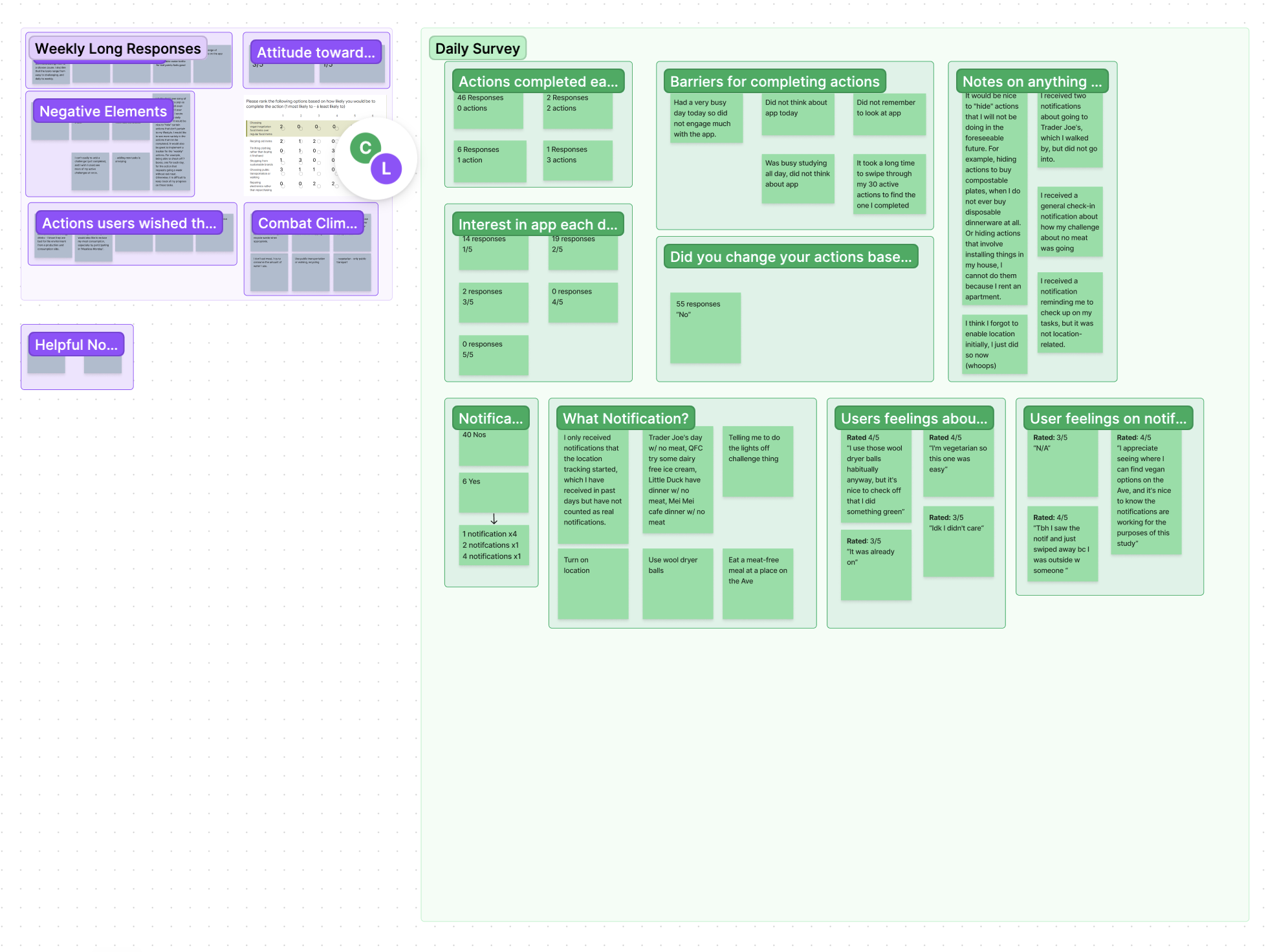
We wanted to explore how users interact with notifications and the app when considering adding geo-location features. Our goal was to understand what motivates users to complete actions and why they might ignore them.
12 users
recruited from word of mouth, online university forums, and campus sustainability clubs
2 week
long duration with daily short surveys and weekly long diary reflections
KEY INSIGHTS
87% of users completed <2 actions per day
94% of users ranked below a 3 when asked to rate their interest in the app on a scale of 1 -5 (1 being the least, 5 being the most)
55 responses said that the notifications did not change their actions
PARTICIPATORY DESIGN
Co-Design Sessions to Understand the “Why” Behind the Actions & Collaborate On Solutions
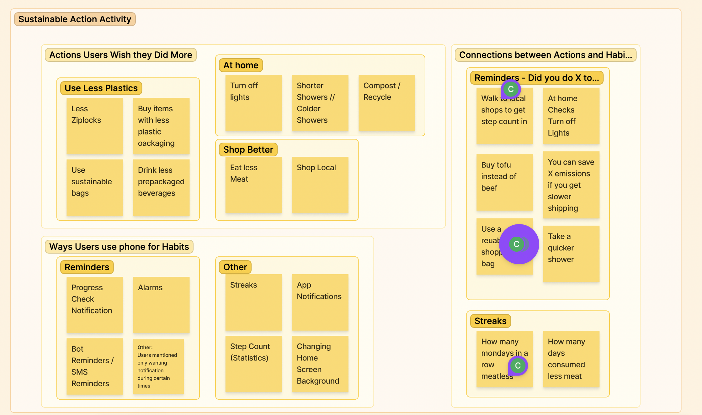
Through collaborative activities and discussions, we unpacked the participants experiences with the app and got insight into how they believe the experience could be redesigned.
6 users
recruited from the diary study sessions
3 activities
conducted during the session revolving around current sustainable habits, habit formation with phones, and experiences using the app
KEY INSIGHTS
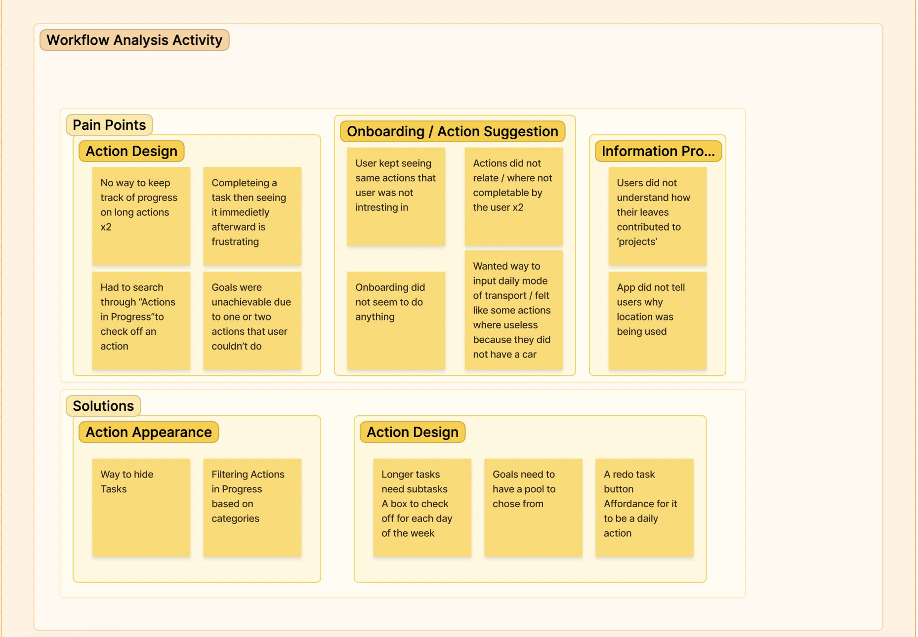
2 users mentioned they wanted a better way to track progress for long actions
4 users mentioned that the actions they received were not relevant to them
2 users mentioned that they wanted more affordances for repeatable actions
SURVEY
Capturing Attitudes on Sustainability, Habit Formation & Location Tracking
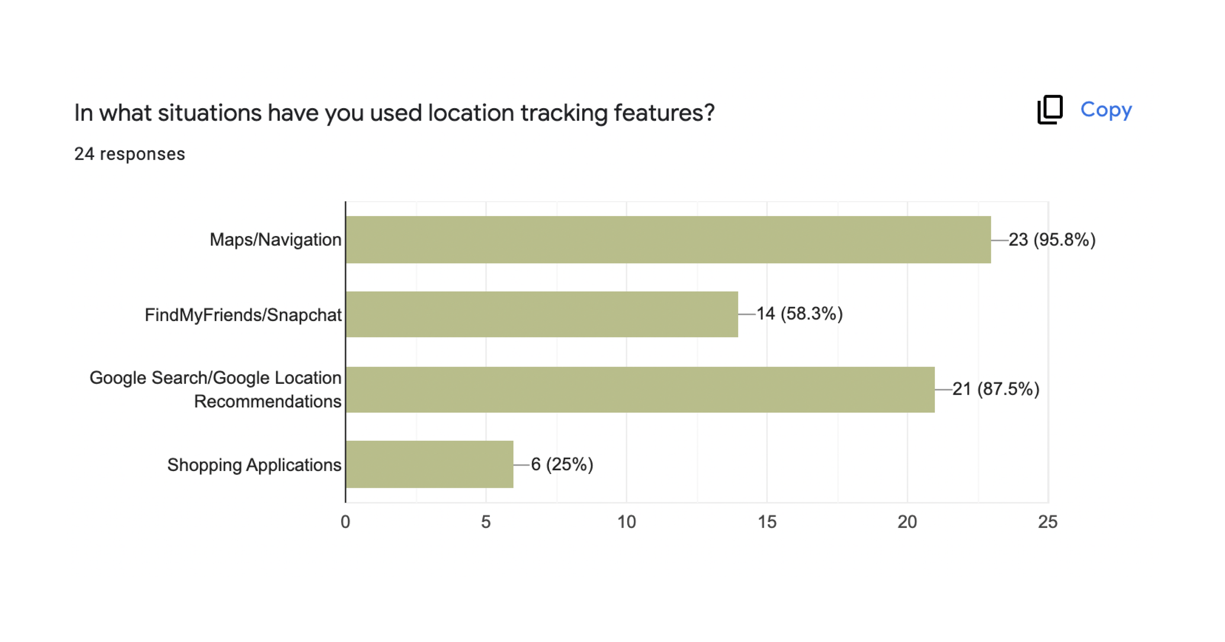
The purpose of the survey was to understand different ways users form habits, what their current sustainability habits are and their thoughts on location-tracking.
36 users
recruited from word of mouth, social media, online forums, and campus sustainability clubs
16 questions
asked in the survey - a blend of qualitative and quantitative insights
KEY INSIGHTS
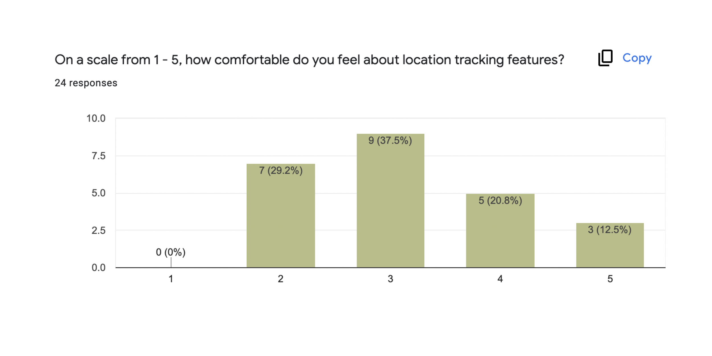
37.5% of user’s scored a 3 on a likert scale asking how comfortable they were with location tracking
phones help users form habits through giving consistent notifications, helping the users maintain a ‘streak’, giving X amount of time per day to a task, and scheduling tasks around schedule
the top 3 sustainable actions people want to start doing is using less plastic, secondhand shopping, and lowering carbon emissions
RESEARCH FINDINGS
Challenges in Saving, Personalization, and Organization of Action Suggestions
Actions that user’s want to complete cannot be saved anywhere.
User’s are unable to save actions they want to complete, forcing them to endlessly scroll to find the action once they have completed it.
Action suggestions are not personalized to the user.
User’s repeatedly receive action suggestions that hold no interest to them or are unrelated and unattainable for their specific circumstances.
No filtering or organization of the action suggestions.
User’s get overwhelmed from the endless amount of options and want a way to filter out/hide action suggestions.
RESEARCH FINDINGS
Challenges in Repeatable Actions, Task Breakdown, and Notification Customization
No affordances for repeatable actions.
Actions that are meant to be repeated, such as walking to the gym, aren't easily distinguishable as repeatable because the design of the action card appears identical to other cards. They also wanted things like a redo button.
Larger tasks are difficult to complete.
Users expressed a desire to break down larger tasks into smaller sub-tasks for improved ease of completion.
No customization of notifications.
User’s have little interest in notifications and want more freedom to customize when they receive notifications.
RESEARCH FINDINGS
How do user’s form habits?
After understanding the challenges users faced when it came to their experience with the app, we wanted to explore different ways to motivate them to stay consistent with their sustainable habits.
68%
of our user’s say breaking apart large tasks into smaller sub-tasks helps them stay consistent with their goals.
54%
of our user’s mentioned finding a way to track their progress helped them complete a goal.
62%
of our user’s mentioned that streaks motivate them to stay consistent with their goals.
DESIGN REDIRECTION
There was a problem. Our research showed that notifications were doing little to nothing with changing people’s behavior. We knew we had to shift gears. We found that there were a lot of usability issues with the core experience of the app and missed potential for leveraging external motivation to increase engagement. So our redesign focused on incorporating motivational design elements and improving the usability issues found in our research.
OUR UPDATED DESIGN QUESTION
How might we engage users in building sustainable habits, ensuring long-term engagement through improving the discovery of actions, optimizing the design of action cards, and integrating motivational design elements?
Key Design Features
Extracting the commonalities from the research insights, 4 unique design features were then outlined to help focus down on what aspects the re-design would embody.
01
Thorough Onboarding Process
Develop an onboarding process that lets users pick a sustainability goal and related actions. The goal is to make the experience more personalized by letting users focus on actions that matter to them and align with their interests and objectives.
02
To-do list layout
Re-design the homepage layout to a to-do list layout for a more organized and efficient user experience. This design eliminates endless scrolling, making it easy for users to find completed actions and receive tailored daily action suggestions that they can customize.
03
Incorporate motivational design
Introduce a progress bar and streaks so that user’s feel incentivized to complete actions and stay engaged with the app.
04
Customizable Notifications
Introduce a notification settings page where user’s have increased control of when and what type of notifications they receive, avoiding unnecessary and unwanted notfications.
Detailing Architecture
WIREFRAMES + USER FLOWS = WIREFLOWS
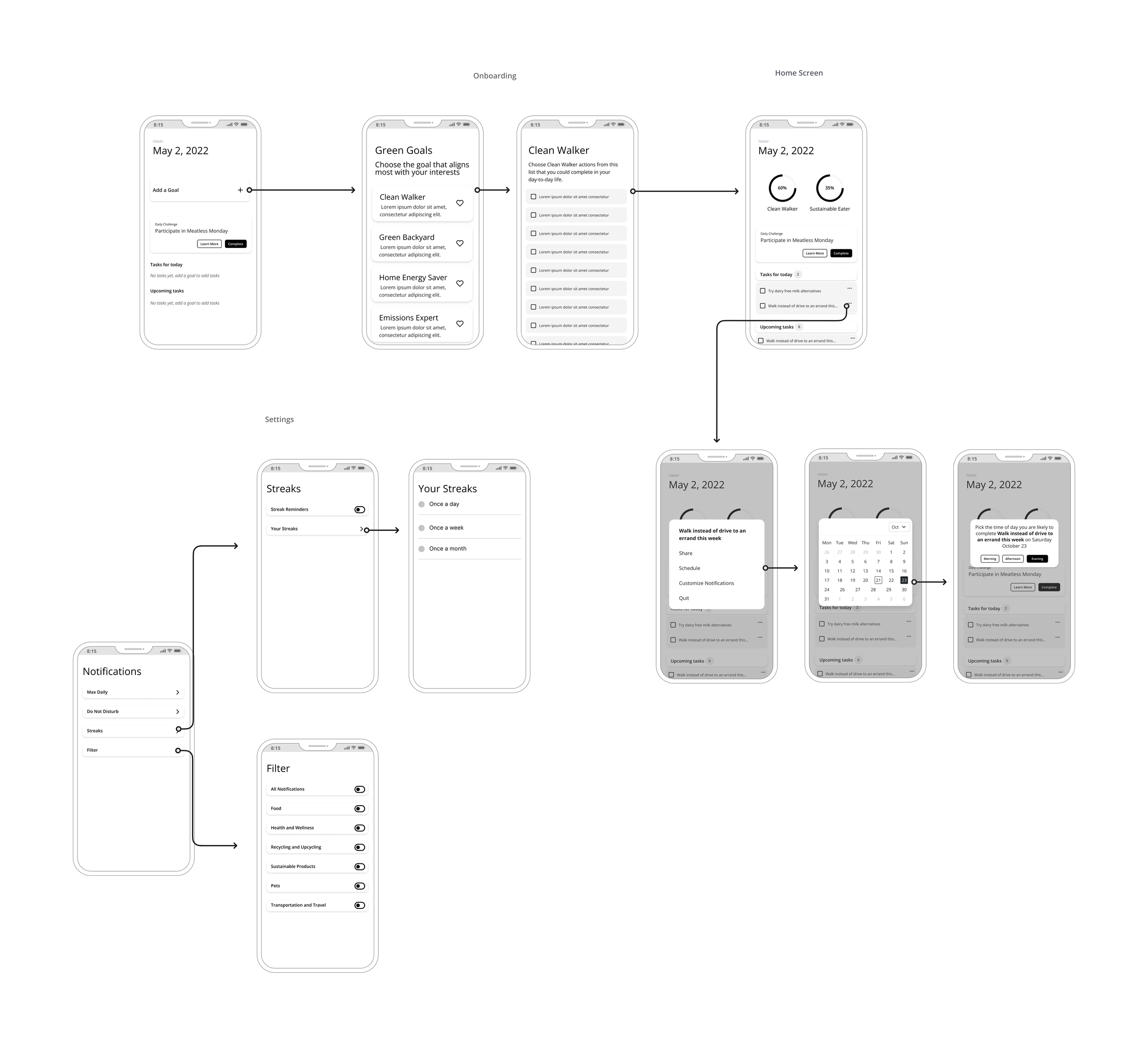
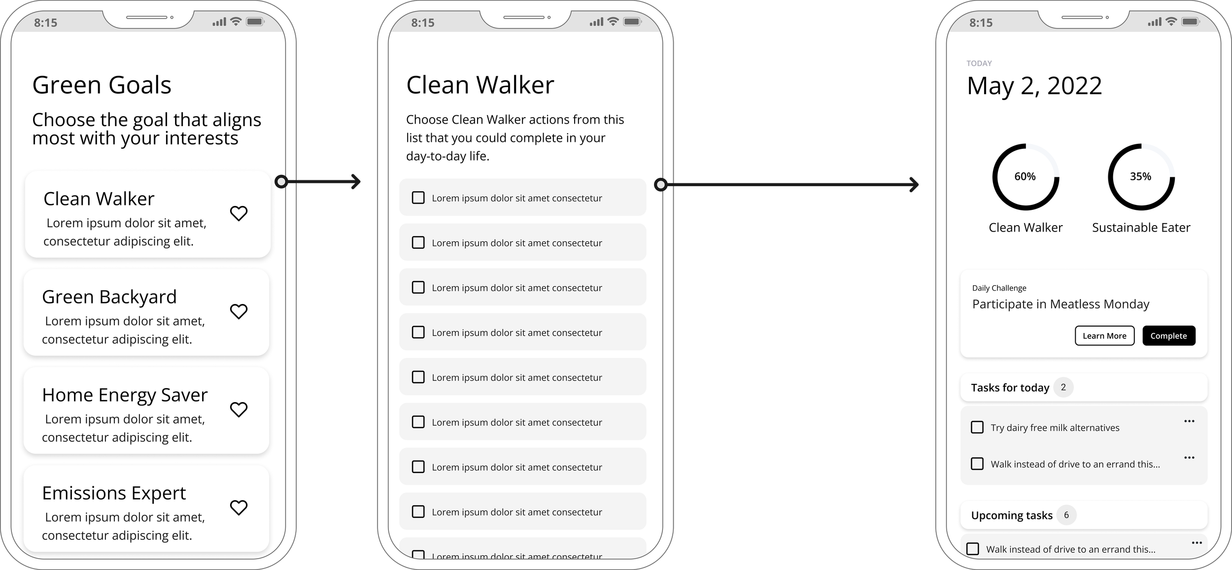
We completely transformed how the user navigates through the app. The whole experience revolves around user’s completing goals rather than random individual actions. To visualize how the different screens interact with one another, our team created wireflows.
ZOOMING IN ON WIREFLOWS
Re-imagining How Users Discover Actions
Rather than overwhelming users with a vast array of actions, we've introduced a personalized action plan. This plan features 1-3 tailored daily suggestions and upcoming tasks that users can easily rearrange based on their convenience. Informed by the user's goals shared during onboarding, this approach streamlines the experience, eliminating the need for users to sift through countless actions. The to-do list layout adds a mental checklist, potentially boosting user motivation to complete tasks. We also added a progress bar and streaks to motivate people to complete actions.
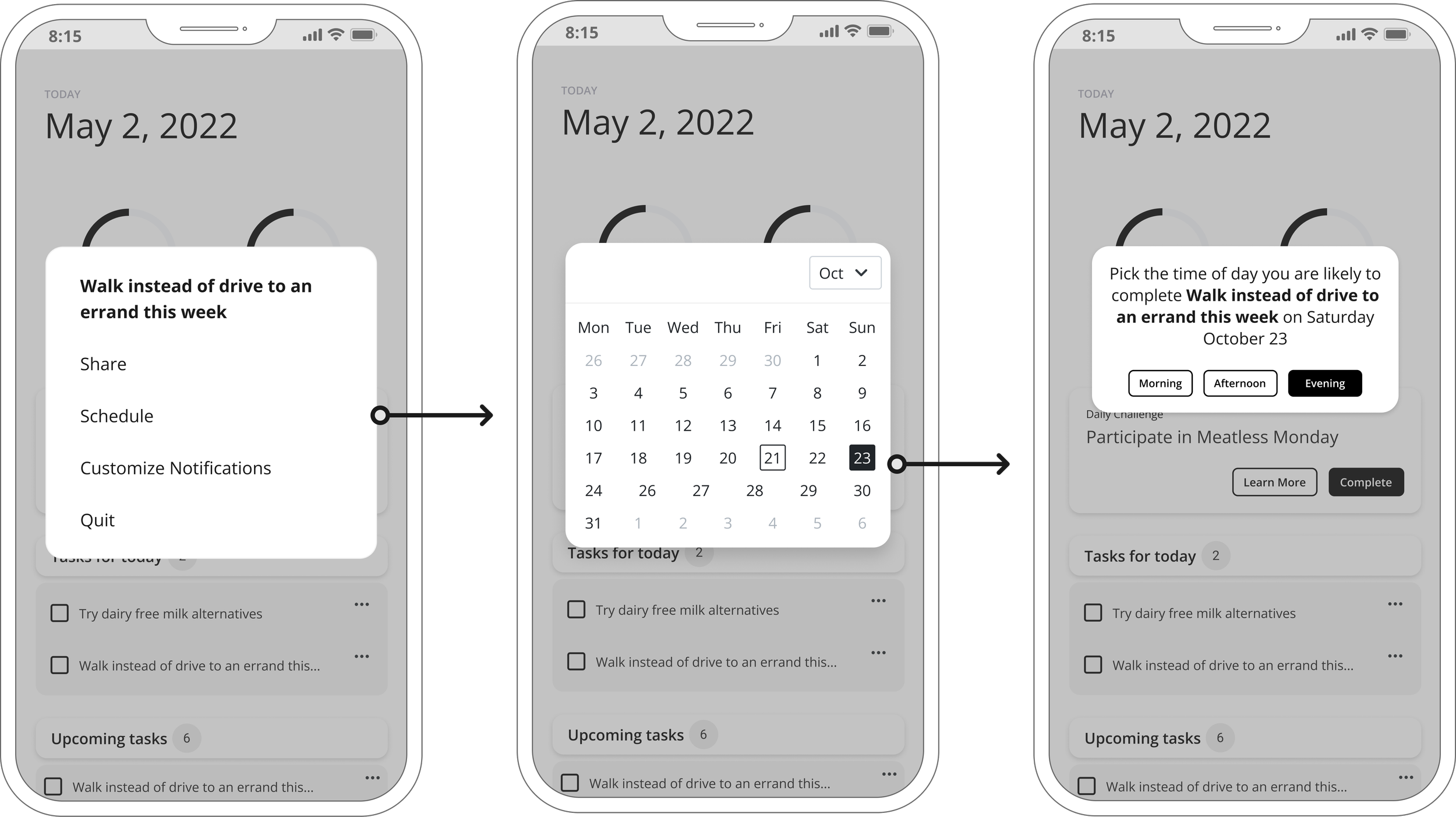
ZOOMING IN ON WIREFLOWS
Providing More Affordances to Repeatable Actions
In our research, user’s mentioned they wanted more affordances to repeatable actions. In our re-design, after a user checks off a repeatable action they receive a pop-up asking them if they want to schedule this action to appear in their plan again and when they want to receive it.
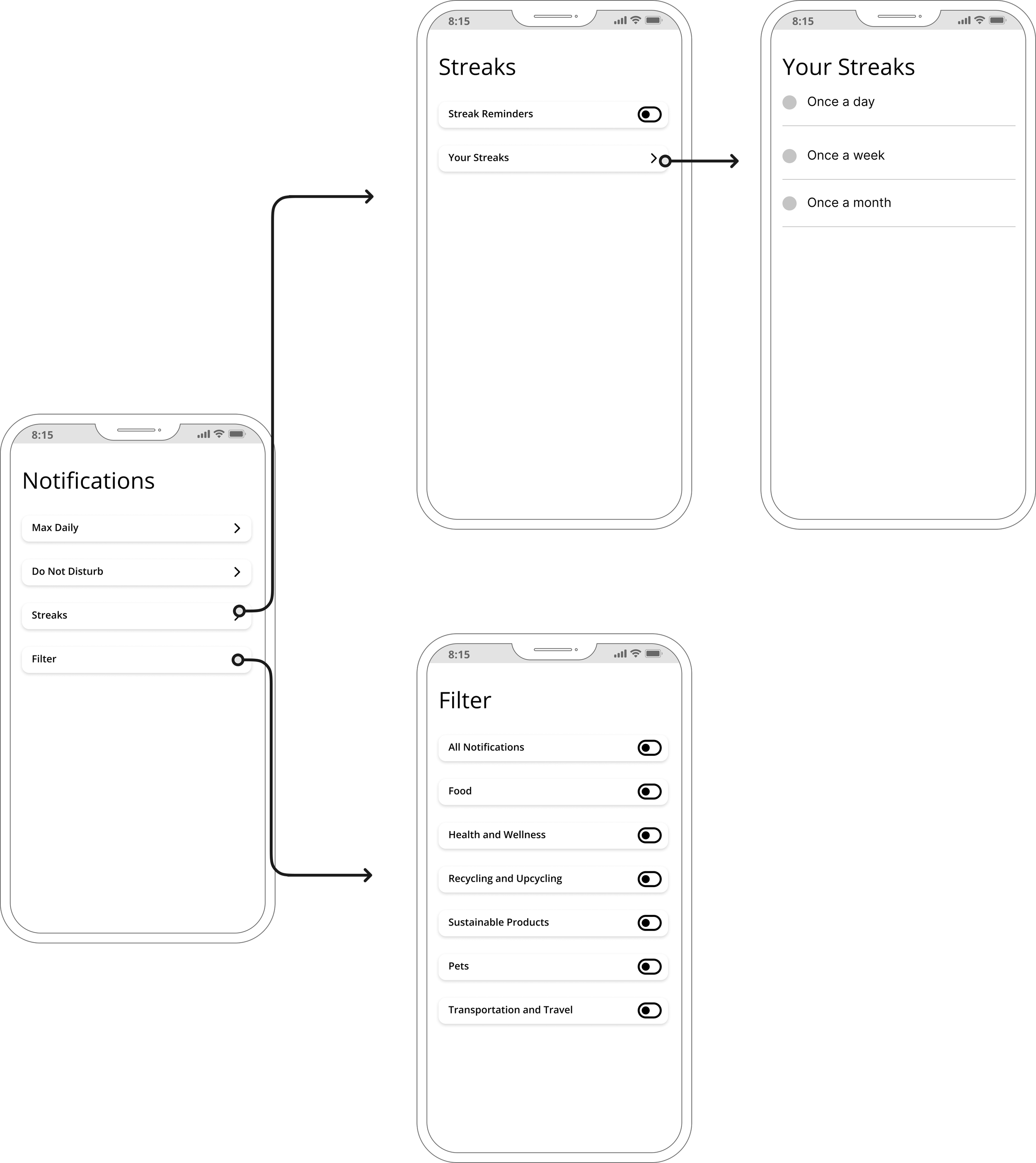
ZOOMING IN ON WIREFLOWS
Customizing Notifications
User’s can customize the type of notifications they want to see and how often they want to be reminded of their streaks. Thus, preventing notification fatigue and loss of interest in app.
USABILITY TESTING
Validating and Refining the Wireframes
It was important to hear what our users had to say in order to catch usability issues and eliminate preconceived assumptions that had emerged from the research and ideation phases. To evaluate the revised app's usability, users were asked to rate it using the US government System Usability Scale (SUS), while also providing feedback on their overall application experience.
4 users
recruited from our friends and acquaintances
4 tasks
completed by our users
KEY INSIGHTS
User’s desired more information before selecting goal.
Frustrations over goal card not being clickable.
User’s were unable to locate complete button.
Users were confused by the terminology in the notification settings.
Medium - Fidelity Prototypes
We implemented the findings from our usability test and leveraged the existing Get Green Style Guide to create the interactive medium-fidelity prototypes.
Repeatable Action Design
We enhanced the intuitiveness of repeating actions by employing user-friendly language and transitioning from selecting specific dates to choosing frequency.
Card Layout
We transitioned from a to-do list format to a card layout, providing users with more upfront information about the action, eliminating the need for additional clicks to learn more.
Cleaner Interaction Design
We made the entire goal card and action clickable.
Goal and Action Information
We included more information about each goal and action in the onboarding process.
Reflection
Be adaptable
Projects rarely follow a straight path, and flexibility is crucial to meeting changing requirements. It’s important to not get stuck on one idea or solution and allow your project to evolve based on the new information.
User’s first, solutions second
The project began with a solution, which later revealed to be ineffective based on user research. This underscores the importance of not going into the process with a solution in mind but rather with the intention to understand your users and explore the problem space with an open mind. It’s not about assuming what your user’s need and using research to validate that, rather its about understanding your users and designing for how they behave.
More research doesn’t mean better
Quality over quantity is just as relevant in the context of user research. Even though the diary study brought to light a crucial discovery—specifically, that geo-location notifications had limited influence on behavior—the depth of insight gained did not match the resources invested in it. Most of our valuable insights actually stemmed from the participatory design session and survey. Therefore, it's important to be thoughtful about what research methodology to use in order to save time and money.
