SONY Electronics
SONY Electronics
Re-designing the upselling strategy within the cart-to-checkout experience, leading to an increase in average order values and attachment rates

TIMELINE
OCT 2022 - DEC 2022
OCT 2022 - DEC 2022
TEAM
3 Designers, 3 Engineers
3 Designers, 3 Engineers
ROLE
Product Designer
Product Designer
BACKGROUND
SONY Electronics, a leading high-end electronics retailer, partnered with Deloitte to enhance their upselling strategy and reduce friction within their mini-cart, cart, and checkout experience.
SONY Electronics, a leading high-end electronics retailer, partnered with Deloitte to enhance their upselling strategy andreduce friction within their mini-cart, cart, and checkout experience.
PROBLEM
The challenge
The challenge
SONY faced challenges in effectively encouraging customers to add installation services, bundle items, and protection plans to their carts. They also faced high drop-off rates during their checkout experience, resulting in them not meeting their KPIs.
SONY faced challenges in effectively encouraging customers to add installation services, bundle items, and protection plans to their carts. They also faced high drop-off rates during their checkout experience, resulting in them not meeting their KPIs.
SOLUTION
The mini cart
The mini cart
Mini-carts provide vital screen real-estate and user attention for upselling products. We took advantage of that.
Mini-carts provide vital screen real-estate and user attention for upselling products. We took advantage of that.
SOLUTION 01
Improved visibility on bundle savings
Improved visibility on bundle savings
We upgraded from a slide-out drawer to an interstitial mini-cart experience, aligning with industry trends. Expanding screen real estate allowed us to showcase bundle savings prominently, enhancing visibility, and facilitating a quick, single-select interaction. We also removed the protection plans to focus users on one task at a time.
We upgraded from a slide-out drawer to an interstitial mini-cart experience, aligning with industry trends. Expanding screen real estate allowed us to showcase bundle savings prominently, enhancing visibility, and facilitating a quick, single-select interaction. We also removed the protection plans to focus users on one task at a time.

SOLUTION
The cart
The cart
A well-designed cart page is essential for reducing drop off rates and a key opportunity to upsell installation services and protection plans.
A well-designed cart page is essential for reducing drop off rates and a key opportunity to upsell installation services and protection plans.

SOLUTION 02
SOLUTION 02
Streamlined the protection plans and installation services with an add-on menu.
Streamlined the protection plans and installation services with an add-on menu.
We streamlined the decision-making process by giving top priority to the default warranty and concealing alternative plan options under a designated CTA. Continued upselling with curated accessory recommendations included in the add-on menu.
We streamlined the decision-making process by giving top priority to the default warranty and concealing alternative plan options under a designated CTA. Continued upselling with curated accessory recommendations included in the add-on menu.
SOLUTION
The checkout page
The checkout page
Checkout is the most critical point of the shopping experience and where the highest rate of drop-offs occur. It’s essential to minimize friction and create a streamlined experience.
Checkout is the most critical point of the shopping experience and where the highest rate of drop-offs occur. It’s essential to minimize friction and create a streamlined experience.
SOLUTION 01
Transforming checkout with accordion style layout, smart address finder, and itemized order list.
Transforming checkout with accordion style layout, smart address finder, and itemized order list.
We’ve transformed our checkout process to provide a more user-friendly experience that stays in tune with current industry trends. This revamp includes adopting an accordion-style page format, streamlining input fields through features like the smart address finder, and introducing an itemized order list so users can refer back to their cart without exiting the checkout experience.
We’ve transformed our checkout process to provide a more user-friendly experience that stays in tune with current industry trends. This revamp includes adopting an accordion-style page format, streamlining input fields through features like the smart address finder, and introducing an itemized order list so users can refer back to their cart without exiting the checkout experience.

STAKEHOLDER WORKSHOPPING
Client discovery workshop to gather requirements
Client discovery workshop to gather requirements
Before conducting any research, we set up a few Figjam workshops to understand the client’s business goals, gather any user research, clarify certain industry terms, and set up some success metrics.
Before conducting any research, we set up a few Figjam workshops to understand the client’s business goals, gather any user research, clarify certain industry terms, and set up some success metrics.
BASELINE METRICS
<1%
<1%
addition of protection plans and bundle savings
addition of protection plans and bundle savings
68%
68%
of users make it to the shipping page (mobile). 62% for desktop
of users make it to the shipping page (mobile). 62% for desktop
20%
20%
of SONY customers have a SONY account
of SONY customers have a SONY account
SUCCESS METRICS
Key success metrics
Key success metrics
Increase in attachment add-on rates
Increase in average cart order values
Increase in cart-to-checkout conversion rates
Increase in number of Sony accountholders
Increase in attachment add-on rates
Increase in average cart order values
Increase in cart-to-checkout conversion rates
Increase in number of Sony accountholders
COMPETITIVE ANALYSIS
Exploring the current e-commerce space
Exploring the current e-commerce space
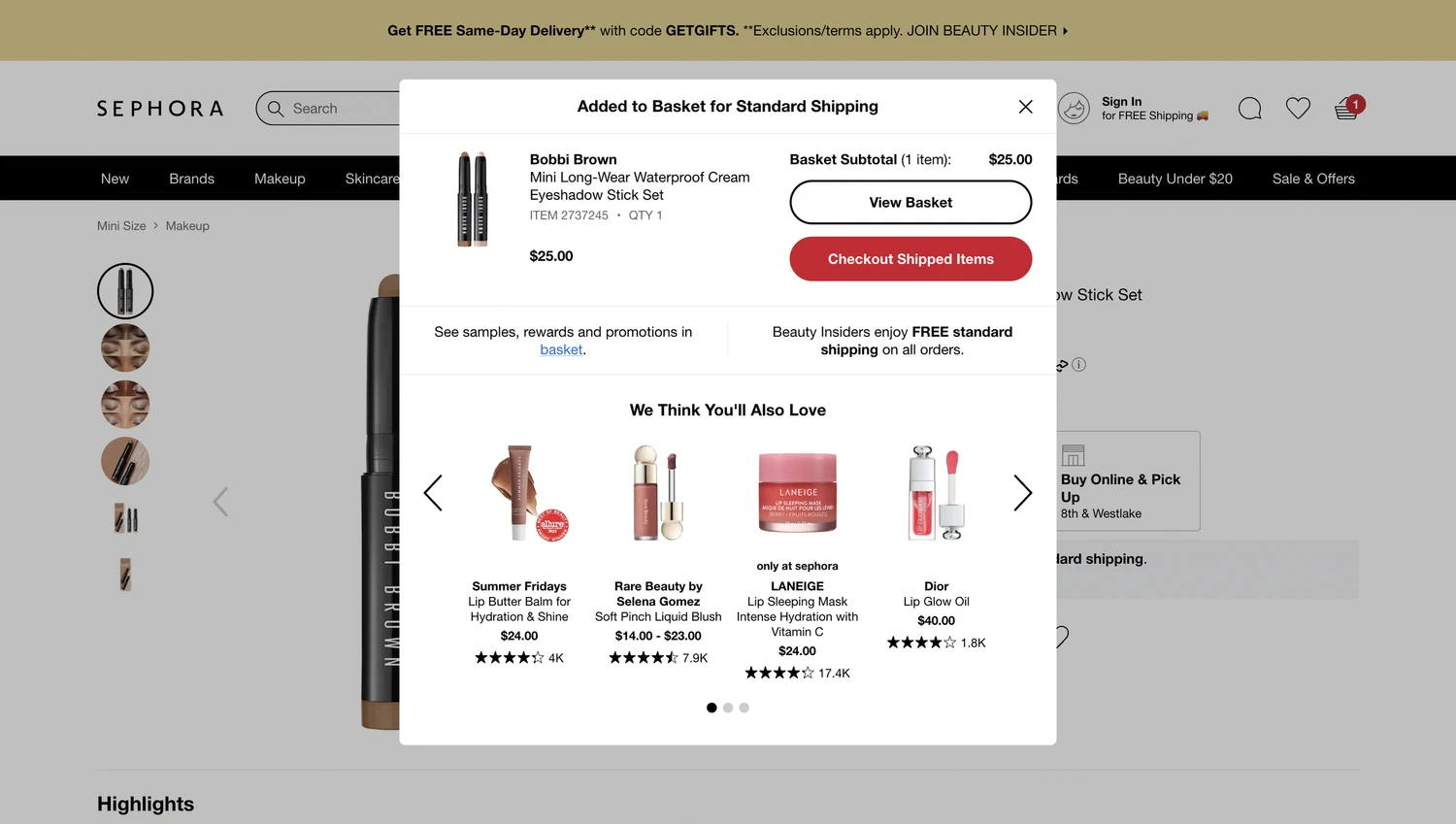
We assessed Sony’s competitors, examining their strengths, weaknesses, and opportunities. Key considerations included their approach to upselling bundles and attachments, the design of mini-cart experiences, appealing features, and the overall cleanliness and seamlessness of interactions
We assessed Sony’s competitors, examining their strengths, weaknesses, and opportunities. Key considerations included their approach to upselling bundles and attachments, the design of mini-cart experiences, appealing features, and the overall cleanliness and seamlessness of interactions


COMPETITIVE ANALYSIS
Bridging the gap between current and desired state
Bridging the gap between current and desired state
We worked with the client, engineering, and product team to compare what we found in our UX audit with what we learned from looking at our competitors. We used sticky notes to highlight potential risks and opportunities in both areas. Keeping in mind our business goals and users, we created a list of potential design features to explore that would bridge the gap between the current and desired state. This ensured alignment on product vision between all stakeholders.
We worked with the client, engineering, and product team to compare what we found in our UX audit with what we learned from looking at our competitors. We used sticky notes to highlight potential risks and opportunities in both areas. Keeping in mind our business goals and users, we created a list of potential design features to explore that would bridge the gap between the current and desired state. This ensured alignment on product vision between all stakeholders.
FINDINGS
Challenges identified
Challenges identified
Bundle items are hidden under a CTA in the product detail page where they are presented in a confusing manner that requires several clicks for users to add to cart.
The lack of clear value propositions and strategic incentives makes it challenging to motivate users to create a Sony account.
Sony failed to seize valuable opportunities to enhance the user experience through upselling of accessories directly relevant to items in the mini-cart and full cart.
Several long forms, multiple pages, and unexpected costs show up in the current checkout experience."
The option to bundle an item is difficult to locate and creates confusion for users.
Bundle items are hidden under a CTA in the product detail page where they are presented in a confusing manner that requires several clicks for users to add to cart.
There are a lack of incentives to create a Sony account.
The lack of clear value propositions and strategic incentives makes it challenging to motivate users to create a Sony account.
There are missed opportunities for upselling relevant accessories.
Sony failed to seize valuable opportunities to enhance the user experience through upselling of accessories directly relevant to items in the mini-cart and full cart.
There is friction in the checkout experience.
Several long forms, multiple pages, and unexpected costs show up in the current checkout experience."
Bundle items are hidden under a CTA in the product detail page where they are presented in a confusing manner that requires several clicks for users to add to cart.
The lack of clear value propositions and strategic incentives makes it challenging to motivate users to create a Sony account.
Sony failed to seize valuable opportunities to enhance the user experience through upselling of accessories directly relevant to items in the mini-cart and full cart.
Several long forms, multiple pages, and unexpected costs show up in the current checkout experience."
The option to bundle an item is difficult to locate and creates confusion for users.
Bundle items are hidden under a CTA in the product detail page where they are presented in a confusing manner that requires several clicks for users to add to cart.
There are a lack of incentives to create a Sony account.
The lack of clear value propositions and strategic incentives makes it challenging to motivate users to create a Sony account.
There are missed opportunities for upselling relevant accessories.
Sony failed to seize valuable opportunities to enhance the user experience through upselling of accessories directly relevant to items in the mini-cart and full cart.
There is friction in the checkout experience.
Several long forms, multiple pages, and unexpected costs show up in the current checkout experience."


FINAL DESIGNS
High-fidelity designs
High-fidelity designs
After finalizing our wireframes, our UI designer started converting them into high-fidelity designs using SONY’s existing design system and brand guidelines while adding new components along the way.
After finalizing our wireframes, our UI designer started converting them into high-fidelity designs using SONY’s existing design system and brand guidelines while adding new components along the way.
FINAL DESIGNS
Mini-cart
Mini-cart
Based on our analysis and industry best practices, we've embraced an interstitial mini-cart page to enhance the shopping experience for smaller cart sizes. Unlike the previous design, where bundle savings were only accessible through a product detail page (PDP) CTA, the new interstitial page prominently showcases bundle savings for the selected product. This streamlined approach offers users quick visibility on available savings and allows them to add items to their cart with a single click. To maintain simplicity, we've also moved protection plans to the cart, focusing users on one task and reducing cognitive overload.
Based on our analysis and industry best practices, we've embraced an interstitial mini-cart page to enhance the shopping experience for smaller cart sizes. Unlike the previous design, where bundle savings were only accessible through a product detail page (PDP) CTA, the new interstitial page prominently showcases bundle savings for the selected product. This streamlined approach offers users quick visibility on available savings and allows them to add items to their cart with a single click. To maintain simplicity, we've also moved protection plans to the cart, focusing users on one task and reducing cognitive overload.


FINAL DESIGNs
Cart
Cart
We streamlined the decision-making process by giving top priority to the default warranty and concealing alternative plan options under a designated CTA. Simultaneously, we elevated the upselling strategy and heightened product discoverability by offering carefully curated accessory suggestions to users, granting them additional ways to explore related products. Furthermore, we adopted an intuitive organization system for attachments, neatly nesting them under their corresponding products for a more user-friendly experience.
We streamlined the decision-making process by giving top priority to the default warranty and concealing alternative plan options under a designated CTA. Simultaneously, we elevated the upselling strategy and heightened product discoverability by offering carefully curated accessory suggestions to users, granting them additional ways to explore related products. Furthermore, we adopted an intuitive organization system for attachments, neatly nesting them under their corresponding products for a more user-friendly experience.
FINAL DESIGNS
Checkout
Checkout
We’ve transformed our checkout process to provide a more user-friendly experience that stays in tune with current industry trends. This revamp includes adopting an accordion-style page format, streamlining input fields through features like the smart address finder, and introducing an itemized order list so users can refer back to their cart without exiting the checkout experience. To enhance focus, we’ve removed secondary navigation elements. Shipping methods have been consolidated into a neat dropdown menu to save space and reduce cognitive load. Lastly, we’ve incentivized account creation by prominently displaying earned points within the cart summary widget, with quick access to the sign-in/sign-up page.
We’ve transformed our checkout process to provide a more user-friendly experience that stays in tune with current industry trends. This revamp includes adopting an accordion-style page format, streamlining input fields through features like the smart address finder, and introducing an itemized order list so users can refer back to their cart without exiting the checkout experience. To enhance focus, we’ve removed secondary navigation elements. Shipping methods have been consolidated into a neat dropdown menu to save space and reduce cognitive load. Lastly, we’ve incentivized account creation by prominently displaying earned points within the cart summary widget, with quick access to the sign-in/sign-up page.
